
Thursday, 15 December 2011

Wednesday, 14 December 2011


Analysis of front cover 2
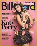
The
masthead being behind the artists, suggesting the artist is more important than the magazines name, or that the
magazine wants to ‘show the artist off’, and knows that their regular target
audience will recognise the magazine because of the masthead text and colours
used. The masthead’s text is narrow, straight and black, giving the idea that
the magazine is straight forward and gets to the point. The letters ‘b,o,a,d’
are all coloured in, changing the idea that the magazine is straight forward
and introducing the idea that the magazine has got a more ‘edgy’ or ‘funky’
feeling to it.
Katy Perry is the model on the front cover, she is known
for some controversial yet modern songs, her strange choice of hair colour and
some of her revealing outfits in music videos. The magazine also wants to
appear controversial and modern. The magazine sees Katy Perry as the ideal
model as she is a strong powerful woman, who knows what she wants and can get
it. She is also appearing to be softer than when she first got known in the
music world. The shot is a mid-section close up shot, and she is turned to the
side making her back arch, showing off her curves. Her arms are held up towards
her chest/neck. Thus making the audience think she is ‘protecting’ herself from
being ‘exploited’, it may also seem as she is ‘acting’ innocent, and holding
her hands on the top of her chest towards her neck as if she is shocked- this
idea of being shocked is changed when we see her facial expression. Her head is
turned the opposite way her body is, as if she is looking over her shoulder,
her eyes however are looking directly into the camera, making it slightly
intimidating but making the reader intrigued about her body language and
expression. Her eye contact is almost tempting the reader to buy the magazine.
Katy Perry is wearing a figure hugging, short dress,
it appears to be black, with a flower print on it. This may be seen as pushing
the boundaries in fashion as a floral print would not normally being associated
with the colour black. The dress does however puff out at the bottom giving her
a less harsh, revealing image. She is being presented as a sex object to men
and at the same time encouraging women to embrace and celebrate themselves, but
she also portrays and image of being a girly stereo type. Her hair is unusually
normal for her usual style, she is known for having pink and blue hair in her
music videos but seems for relaxed on the cover of a magazine. Her hair is
styled in a old-fashioned way, her blunt full fringe implies she is strong and
has confidence.
Her makeup is also calm, she has
bright dark pink lips and some slight blusher, and she appears to be going for
the girly stereo type image. Katy Perry is holding a collection of flowers,
some are on her head, others around her dress and some in and around her arms.
You do not normally find flowers on a cover of a pop
music magazine, most magazines that have flowers on the cover are either
gardening magazines or on the cover of bridal magazines. Any flowers that are
on magazine covers are usually are usually in a vase or in a model’s hands, in
a bouquet form. However Katy Perry and Billboard magazine are pushing the
boundaries, in a gentle subtle way that that won’t offend anybody. If they used
animals for example it will be controversial but may upset some people.
There is a puff in the bottom of the right hand corner
of the magazine which is normally a place for unimportant information, but the
puff draws attention to it. The text in the puff is yellow and white, two
colours which stand out compared to the rest of the magazine. The puff is
outlined in orange but has the background image of the actual background,
making sure to not divert too much attention away from the artist on the cover.
‘Katy Perry’ is the second largest text on the front
cover of the magazine, it will grab people’s attention and sell more magazines,
as some people buy magazines because their favourite artist is on the front
cover or if there is an article about them.
The mode of address is relevant to the genre of music,
the main sell line is under the text ‘Katy Perry’ the main sell line is ‘Inside
The Court Of The New Queen Of Pop’, this confirms the genre of music that the
magazine celebrates. ‘Queen of pop’ gives Katy Perry an even higher status that
she already has, this may also influence the reader in their taste of music, as
they value the opinion of the magazine. Each word in the main sell line begins
with a capital letter making sure that each word in the sell line is equally
important.
All of the sell-lines are on the left of the magazine
as that is where the majority of people look first. There is an equal spacing
between each sell-line, it looks simple and tidy. On top of each sell-line
there is a small phrase the text is coloured yellow to draw people to the
sell-lines.
The sell-line that is on the top left is a question
‘Can Taylor swifts one album debut with a million sold?’, which interests the
audience to buy the magazine and find out the answer. There are no sell-lines
on the right hand side of the magazine but there is a ‘mini’ sell-line in above
the masthead on the right and it has the third largest text on the magazine.
The text reads ‘Sheryl Crow’ this is to make the magazine appeal to people who
are not huge fans of Katy Perry, but still enjoy reading the magazine.
There is no use of iconography on the cover of the
magazine as most people would recognise Katy Perry as being a singer.
Overall the magazine has is simple, elegant and fun.
Cover of OBSESSED MAGAZINE

The main sell line on the cover reads 'exclusive interview with dylan' the text is coloured yellow and the word 'dylan' is highlighted in pink, as it is on the contents page and double page spread to maintain brand identity and highlight certain words.
As on most magazines i have used the conventions of having a barcode, price and date line.
On the bottom right corner- where the eye usually does not go to- i have added an image of a lipstick mark with the word 'music' in it, to state that the magazine loves music- and also acts as a link to the main image of the artist with lipstick marks on his face. There is another sell line about 'Beyonce' as my teacher said i should include strong independant female artists to support my target audience profile and mission statement. The word 'everything' is in a larger text making the word stand out more, and attracting the reader to the sell-line.
Another sell line is 'OBSESSED with fashion? Get this seasons must haves!" the word 'obsessed' is a smaller version of the masthead again keeping the brand identity running throughout the magazine.
I have few sell-lines, which i liked the look of on the billboard magazine, as i want the magazine to appear sophisticated and sleek.
Double page spread from OBSESSED MAGAZINE

The double page spread consists of an interview with the main artist, who is also on the cover of the magazine. On the top right hand side of the right page has a copy of the masthead on the front cover, thus maintaining the brand identity. I have two pull quotes, in a larger text and different to every other type of text, as well as a different colour- to get more attention to it.
I have four smaller images, that have been slightly altered with circles cut out of them to make it look as if they are balancing on each other, the smaller images make the article look easier to approach and read. There is a short introduction to the interview and then five questions which are highlighted as on the contents page- again maintaining brand identity. However the questions are highlighted a different colour to that of the contents page.
All over the page i have stars, to represent the artist as being a star and also give it a more interesting visual overall image. At the bottom of the page i did not have enough space to continue the interview so put in a brief section of text telling the reader to turn over to find out more about the star.
Contents page of OBSESSED MAGAZINE

The contents page follows conventions of other music magazines as it includes a date line and a heading saying 'contents'. I have kept the brand identity running through to the contents page as the mastheads type of font is also on the contents page. I was inspired by NME's contents page to add a play list of the 'best music', and included some artists that i have previously mentioned. I have also included a small competition section that is a regular feature in the magazine. I have an image of a lipstick kiss mark, that has the writing 'music' in it. This will link the front of the cover of the magazine to the contents page, as well as the small image of the artist at the bottom of the page- with lipstick marks on his face.
The image on the left is the main image, as the artist is on the cover and a main article is about him. There is a headline reading 'EXCLUSIVE INTERVIEW WITH DYLAN'- I highlighted the background of this text by using a paint brush tool on photo shop. By using the word 'exclusive' it makes the reader feel like they are reading something special that not everyone else has access to read. I included a puff saying 'PLUS 2 FREE POSTERS' - a lot of people are enticed to buy the magazine if they see they are getting something extra for free.
The contents all have page numbers which is a convention used in all magazines.
At the bottom of the page i have added information on how to subscribe to the magazine as well as the web address.
My teacher said my biggest challenge would be choosing sophisticated artists to feature in the magazine, so to keep the idea of the sophisticated element i added a 'title' of 'voted most sophisticated pop music magazine of the year'- the text was the same font as the masthead- keeping the brand identity.
Extra Research

I presented a range
of magazines including music, travel, fashion and cooking magazines to members of
the target audience I will have for my magazine- young adult females. I asked
them which of the magazines masthead stood out to them the most and why?
The feedback from my target audience was that the ‘olympic’ magazine, did not appeal to them, as the
target audience are not extremely interested in travelling. The masthead
however caught their attention, as the background colour contrasted with the
masthead colour. ‘Glamour’ magazine and Traveller magazine also stood out a lot
to the target audience of my magazine. ‘Glamour’ magazine’s masthead is bright
and bold, it also stands out as it has all upper case letters. ‘Marie Claire’
also has a bright background. The magazine ‘Country Life’ did not appeal to my
target audience and they said that it and ‘Women and home’ both have masthead
colours that are too similar to the background, and it looked as if the
masthead was disappearing into nothing. The target audience said that the
background of ‘Red’ magazine caught their attention as it is bright and again
contrasting to the masthead. I was also told that the ‘olympic’, ‘traveller’,
‘glamour’ and ‘ Red ’ magazines were all very busy.- For my magazine I think I
will have the masthead and background colours contrasting, to grab the audience’s
attention, however keeping the background simple and only have two or three
colours, as in my previous project (school magazine) the background of the
cover had too many objects in it.
The target audience for my music magazine found the ‘Red’
magazine attractive, mostly because of the model, Kate Hudson, as she was
friendly and almost inviting the reader to open the magazine.
Subscribe to:
Posts (Atom)