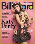
Thursday, 15 December 2011
Wednesday, 14 December 2011
Analysis of front cover 2
The
masthead being behind the artists, suggesting the artist is more important than the magazines name, or that the
magazine wants to ‘show the artist off’, and knows that their regular target
audience will recognise the magazine because of the masthead text and colours
used. The masthead’s text is narrow, straight and black, giving the idea that
the magazine is straight forward and gets to the point. The letters ‘b,o,a,d’
are all coloured in, changing the idea that the magazine is straight forward
and introducing the idea that the magazine has got a more ‘edgy’ or ‘funky’
feeling to it.
Katy Perry is the model on the front cover, she is known
for some controversial yet modern songs, her strange choice of hair colour and
some of her revealing outfits in music videos. The magazine also wants to
appear controversial and modern. The magazine sees Katy Perry as the ideal
model as she is a strong powerful woman, who knows what she wants and can get
it. She is also appearing to be softer than when she first got known in the
music world. The shot is a mid-section close up shot, and she is turned to the
side making her back arch, showing off her curves. Her arms are held up towards
her chest/neck. Thus making the audience think she is ‘protecting’ herself from
being ‘exploited’, it may also seem as she is ‘acting’ innocent, and holding
her hands on the top of her chest towards her neck as if she is shocked- this
idea of being shocked is changed when we see her facial expression. Her head is
turned the opposite way her body is, as if she is looking over her shoulder,
her eyes however are looking directly into the camera, making it slightly
intimidating but making the reader intrigued about her body language and
expression. Her eye contact is almost tempting the reader to buy the magazine.
Katy Perry is wearing a figure hugging, short dress,
it appears to be black, with a flower print on it. This may be seen as pushing
the boundaries in fashion as a floral print would not normally being associated
with the colour black. The dress does however puff out at the bottom giving her
a less harsh, revealing image. She is being presented as a sex object to men
and at the same time encouraging women to embrace and celebrate themselves, but
she also portrays and image of being a girly stereo type. Her hair is unusually
normal for her usual style, she is known for having pink and blue hair in her
music videos but seems for relaxed on the cover of a magazine. Her hair is
styled in a old-fashioned way, her blunt full fringe implies she is strong and
has confidence.
Her makeup is also calm, she has
bright dark pink lips and some slight blusher, and she appears to be going for
the girly stereo type image. Katy Perry is holding a collection of flowers,
some are on her head, others around her dress and some in and around her arms.
You do not normally find flowers on a cover of a pop
music magazine, most magazines that have flowers on the cover are either
gardening magazines or on the cover of bridal magazines. Any flowers that are
on magazine covers are usually are usually in a vase or in a model’s hands, in
a bouquet form. However Katy Perry and Billboard magazine are pushing the
boundaries, in a gentle subtle way that that won’t offend anybody. If they used
animals for example it will be controversial but may upset some people.
There is a puff in the bottom of the right hand corner
of the magazine which is normally a place for unimportant information, but the
puff draws attention to it. The text in the puff is yellow and white, two
colours which stand out compared to the rest of the magazine. The puff is
outlined in orange but has the background image of the actual background,
making sure to not divert too much attention away from the artist on the cover.
‘Katy Perry’ is the second largest text on the front
cover of the magazine, it will grab people’s attention and sell more magazines,
as some people buy magazines because their favourite artist is on the front
cover or if there is an article about them.
The mode of address is relevant to the genre of music,
the main sell line is under the text ‘Katy Perry’ the main sell line is ‘Inside
The Court Of The New Queen Of Pop’, this confirms the genre of music that the
magazine celebrates. ‘Queen of pop’ gives Katy Perry an even higher status that
she already has, this may also influence the reader in their taste of music, as
they value the opinion of the magazine. Each word in the main sell line begins
with a capital letter making sure that each word in the sell line is equally
important.
All of the sell-lines are on the left of the magazine
as that is where the majority of people look first. There is an equal spacing
between each sell-line, it looks simple and tidy. On top of each sell-line
there is a small phrase the text is coloured yellow to draw people to the
sell-lines.
The sell-line that is on the top left is a question
‘Can Taylor swifts one album debut with a million sold?’, which interests the
audience to buy the magazine and find out the answer. There are no sell-lines
on the right hand side of the magazine but there is a ‘mini’ sell-line in above
the masthead on the right and it has the third largest text on the magazine.
The text reads ‘Sheryl Crow’ this is to make the magazine appeal to people who
are not huge fans of Katy Perry, but still enjoy reading the magazine.
There is no use of iconography on the cover of the
magazine as most people would recognise Katy Perry as being a singer.
Overall the magazine has is simple, elegant and fun.
Cover of OBSESSED MAGAZINE
The main sell line on the cover reads 'exclusive interview with dylan' the text is coloured yellow and the word 'dylan' is highlighted in pink, as it is on the contents page and double page spread to maintain brand identity and highlight certain words.
As on most magazines i have used the conventions of having a barcode, price and date line.
On the bottom right corner- where the eye usually does not go to- i have added an image of a lipstick mark with the word 'music' in it, to state that the magazine loves music- and also acts as a link to the main image of the artist with lipstick marks on his face. There is another sell line about 'Beyonce' as my teacher said i should include strong independant female artists to support my target audience profile and mission statement. The word 'everything' is in a larger text making the word stand out more, and attracting the reader to the sell-line.
Another sell line is 'OBSESSED with fashion? Get this seasons must haves!" the word 'obsessed' is a smaller version of the masthead again keeping the brand identity running throughout the magazine.
I have few sell-lines, which i liked the look of on the billboard magazine, as i want the magazine to appear sophisticated and sleek.
Double page spread from OBSESSED MAGAZINE
The double page spread consists of an interview with the main artist, who is also on the cover of the magazine. On the top right hand side of the right page has a copy of the masthead on the front cover, thus maintaining the brand identity. I have two pull quotes, in a larger text and different to every other type of text, as well as a different colour- to get more attention to it.
I have four smaller images, that have been slightly altered with circles cut out of them to make it look as if they are balancing on each other, the smaller images make the article look easier to approach and read. There is a short introduction to the interview and then five questions which are highlighted as on the contents page- again maintaining brand identity. However the questions are highlighted a different colour to that of the contents page.
All over the page i have stars, to represent the artist as being a star and also give it a more interesting visual overall image. At the bottom of the page i did not have enough space to continue the interview so put in a brief section of text telling the reader to turn over to find out more about the star.
Contents page of OBSESSED MAGAZINE
The contents page follows conventions of other music magazines as it includes a date line and a heading saying 'contents'. I have kept the brand identity running through to the contents page as the mastheads type of font is also on the contents page. I was inspired by NME's contents page to add a play list of the 'best music', and included some artists that i have previously mentioned. I have also included a small competition section that is a regular feature in the magazine. I have an image of a lipstick kiss mark, that has the writing 'music' in it. This will link the front of the cover of the magazine to the contents page, as well as the small image of the artist at the bottom of the page- with lipstick marks on his face.
The image on the left is the main image, as the artist is on the cover and a main article is about him. There is a headline reading 'EXCLUSIVE INTERVIEW WITH DYLAN'- I highlighted the background of this text by using a paint brush tool on photo shop. By using the word 'exclusive' it makes the reader feel like they are reading something special that not everyone else has access to read. I included a puff saying 'PLUS 2 FREE POSTERS' - a lot of people are enticed to buy the magazine if they see they are getting something extra for free.
The contents all have page numbers which is a convention used in all magazines.
At the bottom of the page i have added information on how to subscribe to the magazine as well as the web address.
My teacher said my biggest challenge would be choosing sophisticated artists to feature in the magazine, so to keep the idea of the sophisticated element i added a 'title' of 'voted most sophisticated pop music magazine of the year'- the text was the same font as the masthead- keeping the brand identity.
Extra Research
I presented a range
of magazines including music, travel, fashion and cooking magazines to members of
the target audience I will have for my magazine- young adult females. I asked
them which of the magazines masthead stood out to them the most and why?
The feedback from my target audience was that the ‘olympic’ magazine, did not appeal to them, as the
target audience are not extremely interested in travelling. The masthead
however caught their attention, as the background colour contrasted with the
masthead colour. ‘Glamour’ magazine and Traveller magazine also stood out a lot
to the target audience of my magazine. ‘Glamour’ magazine’s masthead is bright
and bold, it also stands out as it has all upper case letters. ‘Marie Claire’
also has a bright background. The magazine ‘Country Life’ did not appeal to my
target audience and they said that it and ‘Women and home’ both have masthead
colours that are too similar to the background, and it looked as if the
masthead was disappearing into nothing. The target audience said that the
background of ‘Red’ magazine caught their attention as it is bright and again
contrasting to the masthead. I was also told that the ‘olympic’, ‘traveller’,
‘glamour’ and ‘ Red ’ magazines were all very busy.- For my magazine I think I
will have the masthead and background colours contrasting, to grab the audience’s
attention, however keeping the background simple and only have two or three
colours, as in my previous project (school magazine) the background of the
cover had too many objects in it.
The target audience for my music magazine found the ‘Red’
magazine attractive, mostly because of the model, Kate Hudson, as she was
friendly and almost inviting the reader to open the magazine.
Analysing contents pages 2
The colours red and black together have a
harsh tone, and reflect the type of music that the magazine celebrates-rock
indie music. Red is a conventional colour in music magazines as it features on
many front covers. The colour red is associated with love/passion- which could
reflect the readers or magazines love for music. It could also reflect the type
of music the magazine features as rock music is often associated with anger- so
is the colour red.
The date us included at the top of the
page, it shows the magazine is up to date and contains the relevant
information. A convention used by many magazines.
The typography is classic, but with rounded
edges adds a new modern feeling to the text. Most of the text on the page is
the same font, a convention employed by many magazines- music and other.
There are three puffs on the page as well
as a starburst. All of the puffs have the letters ‘NME’ in the puff to maintain
brand identity and remind the reader of the name of the magazine- which is like
a celebration of the name. On the other hand it could give a detrimental effect
as it may be an annoyance to some people- however this may be a good thing as
the name may stick in a person’s head and the person will remember the name and
may talking about it to other people.#, spreading the name of the magazine as
well as interest.
Two of the puffs also have the word ‘club’
which makes the reader feel like they are part of the exclusive ‘cool’ club. Or
it could remind the reader of a club with lots of loud music, dancing and
spending time with friends, which has a positive effect on the reader as it may
bring back good memories and they will then be more likely to buy the magazine.
The third puff has ‘TV’ which reminds the
audience that there is other media that the magazine is involved in. Cross
media synergy, is the magazine using different branches of their brand to
advertise each other. The main space has
a large image of DJ’s and the headline reads: ‘The hottest tunes picked by our
Club NME DJ’s around the UK this week’. The wording is appealing as many people
who read the magazine feel part of the ‘NME club’ and want to find out the
‘hottest tunes’ and who the ‘Club NME DJ’s’ are. The location of the image
seems to be on top of a roof- a forbidden place to many because of the danger
of falling off. The DJ’s then seem more powerful as they are there. The
background appears to be a old city, adding character to the DJ’s.
The DJ’s are all posing as if they are not
being photographed, giving the idea that they are relaxed and calm, and aren’t
too fussed that they are being photographed- which is more conventional for
indie/rock artists. They seem more approachable and easy to relate to. The text
above the image confirms that they are the ‘hottest DJ’s in the UK’ and that
the readers should trust their opinion and listen to the music they play and
mix.
There is a starburst coloured red which
contains a white number ‘1’ in the middle, this starburst is deliberately
situated here as the reader makes the connection between the number one-being
the best- with the image of the DJ’s. Beneath this is the list of the most
popular songs and who sings them. The third song is highlighted with a blue
background and has an image with a caption providing extra information; there
is an article about that artist in the magazine.
Having the ‘hottest tunes’ on the contents
page can persuade or influence the target audience’s taste in music. This
establishes the magazine as one exclusively about music- and when repeated in
each edition brand identity is maintained. If you are not familiar with the
magazine then it will show the audience what type of music the magazine
celebrates and who it supports.
At the bottom right hand side of the page
is usually an abandoned section of a page as many people do not pay attention
to what is there but this magazine has used a voucher to grab attention “£2
OFF!” the font is coloured yellow catching attention and the lure of money off
is a powerful lure-as it appeals to everyone. Anything that has a discount on
it draw in attention on to the page, which may influence the reader to page
through then rest of the magazine and then buy it. The terms and conditions are
in a much smaller font size, as it usually aims to catch out the person or is
un-interesting information.
On the bottom left section of the page
there is an advertisement on ‘future club nme tour’ this will show the readers
where and when the next performance is and they will possibly want to find out
more, they may be tempted to buy the next edition and find out more. By
repeating this advertising of gigs it will maintain the magazines brand
identity as not many other magazines do this. The readership of NME go to gigs
and performances often so this will appeal to them.
Analysing front covers 1
The mast head behind the models head
suggests that the magazine is popular and well established to have part of it
covered by the main model. This also suggests there is a loyal readership for
this magazine, and tells us the magazine sees
the huge selling power of the artist on the front cover. The model will
possibly attract a different target audience, if they love Justin Bieber then
they will not be that concerned about the name of the magazine.
The masthead has a unusual feature as the
shape of the text is outlined in a white bubble type of shape- which is
youthful, fun and innocent. The masthead being pink suggests that the magazine
is targeted at the stereo-type-girly-girl younger girls. The masthead being
outlined in the white bubble-type-text, gives the magazine a softer appearance,
from bright pink to white contrasts the first impression of the magazine.
Bright pink makes the audience think that this magazine is daring and fun but
the white background to the text makes the audience re-think their initial
thoughts as the colour white implies the magazine is pure and will not contain
any controversial articles. The colours in the masthead could also be to
reflect the audience as the audience can have a fun, out spoken personality,
but they are good, honest people.
The spiral gives the magazine a sort of status
and authenticity, as no other magazine employs the same logo. The television
program was on the BBC and by now having magazines to replace the television it
suggests, that the audience value something that they can hold and have access
to at any time. Rather than having to watch the program at a certain time and
certain channel.
The background colour appeals to the
targeted audience younger girls, but the magazine is not stereo-typing as much,
as girls who like the colour purple may not be seen as ‘girly’ as those who
like the colour pink. The colour appears to be darker at the top of the
magazine and gradually gets lighter going towards the bottom, this may have
been employed to let the eye naturally flow down the magazine cover. The colour
may relate to the artist as he has been seen often wearing the colour purple or
it may be his favourite colour! Lilac purple is a very feminine colour which
will appeal to the target audience.
The artist on the front cover is Justin
Bieber, he is known for his ‘love’ songs and is attractive to younger girls. He
is smiling showing his teeth, which in turn suggests he is happy and gives him
an innocent look. His body is angled slightly, and his head tilted as well-
this gives him a more approachable look, and does not make him seem like a
untouchable star. He looking and pointing directly at the camera, which means
the audience, will sense a sort of connection as he is directly addressing
them.
Justin Bieber has a ‘boy-next-door’
appearance, and is seen as very wholesome and unassuming, and while he
maintains an innocence about him. Very sincere, sometimes shy, this makes him
popular with young teenage girls who admire his music and the lyrics he uses.
Justin is wearing a white shirt, which
implies that he is innocent and pure, and would never hurt a girl- making more
young teenage girls ‘fall’ for him. It is conventional for this magazine to
feature boy “crushes” on the front.
There is a use of a graphic, it looks like
a hypnotic spiral, that appears to be disappearing or getting smaller and going
into the covers background, this could be to show that the information inside
the magazine will hypnotise you because it is so great, or to show that the
magazine will hypnotise you to buy it, or to first open it, it is provoking the
reader to want to be hypnotised. There is also the logo of ‘BBC’ in the top
left hand corner which reminds the reader that the ‘BBC’ own the magazine and
may want to remind the general public that they are still young and know what
the public want in media. It may also be to remind people that the ‘BBC’ have
other mediums of media other than just television, but magazines and internet
websites.
Taylor Lautner- another boy “crush”- also appears on
the cover and is the second largest image on the magazine. He may appeal to an
older girl who enjoys watching films and reading books that he is in, there is
a sell-line under his image saying “Could you be Taylor’s girl? Find out
inside!” This would really appeal to a Taylor Launtner fan, they would love to
be his girl!. This is addressing the audience directly by using the word ‘you’
it also entices the reader to look inside to find out if they are could be
‘Taylor’s girl’. Underneath that is another sell-line which is targeted at the
overall target audience “BOYS What they really think about!” the word ‘BOYS’
being in upper case letters grabs the reader’s attention as the majority of the
target audience enjoy listening to music and are also interested in boys. On
the bottom of the magazine there is half a banner- which suggests that you will
find out more inside the magazine. It has an image of Cheryl Cole- who is a
role model for younger girls and is has a sell line on ‘Cheryl’s £3.89 beauty secret’
and ‘OMG’. This mode of address to the audience is for younger teenagers, as it
uses the shorter version of ‘oh my God’ as ‘OMG’ which is also used in texting-
which teenagers do often- the magazine is on the same wavelength and is like a
friend. ‘Beauty secret’ makes the reader feel special that they will know a
secret that no one else will know and that they will possibly get to look more
like their role model.
On the left of
the small banner is a purple puff with the text ‘Win! MEET JLS’ and a small
image of the group. This is drawing in the reader as the majority like the
group and would love to meet them. The wording makes it sound more possible
that you could meet JLS. Underneath this
is a sell line, with slim white text, with a black background, it reads “Dying
for a tan? The shocking truth about sun bathing”. ‘Shocking” has an effect of
shock as most people believe everything the magazine says. The black background
suggests that there is in fact a ‘dark’ side to sun bathing, and reinforces the
idea that the reader does not know the truth about sun bathing. This article is
aimed less at music fans and more at gossip magazine fans, making the magazine
appeal to more than one type of audience member.
The largest sell-line is a pull quote from an
interview saying “Wanna see my bedroom” this may be shocking and scandalising
to younger girls as they my love the artist and want to find out as much as
they can about him. To a older audience member it seems more innocent and
appealing as they feel they will get time with Justin Bieber. It also looks
scandalous as fans will want to see something that is personal to him. The sell
line ‘PRIVATE PICS!’ is reinforcing the idea that not a lot of people will get
to see this and the mode of address is relaxed as ‘pics’ is used instead of
‘pictures’. There is also a small puff saying “yes really” again reminding the
audience that this does not happen often and that this is a luxury to see his
bedroom. Most of this section is coloured yellow which is where the eye is
drawn to first.
Above that sell-line is a sell-line saying “Love your
summer! make it your best yet” this is addressing the target audience directly
as they will have a long summer holiday and it is suggesting that the magazine
wants the reader to have a good summer- acting like a friend, and boasting
self-confidence of the reader.
Inspiration for images
I was inspired by this video to try and re-create it in an image- although i did not have access to jelly beans and special equipment. Here are some images i took of my model, laying on a table with interesting backgrounds:
I do not think i will use any of these images as they do not stand out a lot and are not of good enough quality.
More practise shots
While editing my contents page, i felt that i needed some images of another artist. My main model- on the cover was in a different country so i got someone else to pose for pictures.
I did not have a lot of time, so i took images of close to where i live, in my garden and down the road. I liked how the sky looked as it was dark, with a lot of interesting shades of grey in the clouds- something you would not normally associate with a pop music magazine but i wanted to see how the images turned out.
I think some of the images are too idie-type, so i will have to choose carefully which images- if any i want to include in my project.
I did not have a lot of time, so i took images of close to where i live, in my garden and down the road. I liked how the sky looked as it was dark, with a lot of interesting shades of grey in the clouds- something you would not normally associate with a pop music magazine but i wanted to see how the images turned out.
Analysing contents pages 1
The contents
page of ‘Billboard’ is split up into two main sections. On the left is the
billboard char – an American chart ‘top 40’.
A convention
used is the page number and a summary of what is on that page- like most
magazines do regardless if they are music magazines or other types. Most of the
text is the same size, but a few of the more dramatic or interesting stories
have slightly larger text as well as it being coloured blue, drawing the eye
there and making the reader turn to those pages first, once they read that
story. This suggests the importance of some editorial content over others. Hopefully
they will be hooked and want to read the rest of the magazine. Sometimes the
small summary of the story includes pull quotes to make the reader interested.
Another
convention employed is that the images are used under the heading of ‘CONTENTS’
this makes the page more visually interesting and adds colour.
The three main
images under the heading are all different, possibly relating to the slightly
different types of people that buy the magazine as well as the different
stories in the magazine. Which suggests the magazine promotes different types
of music, which is also reflected by their different costume too. The first
image appears to be an older man, dressed in plain uniform and a hat, playing a
guitar- which gives the reader the idea that he does not worry about costume or
the set, he just focuses on music. The second looks like a new artist with
unusual hair and clothing, there are many people behind her also dressed in
colourful clothes- suggesting that she has a lively, busy lifestyle and is
always surrounded by people- a sign that she is a good person and friendly. The
last image an artist- Katy Perry- performing on stage in costume with a
microphone in her hand, this shows the artist in action, singing to her fans.
The different pictures and people in them can be a way of targeting different
audiences to read the magazine.
On the images there are page numbers- a
convention used by most magazines- which will direct the audience to the page
that relates to that image.
On the bottom half of the page is an image
that takes up about half the page, it has two male presumably artists looking
very solemn, they are standing up against a background that is white and
appears to be wooden- possibly a café or somewhere near the sea side, but with
the plant coming into the frame it appears to be somewhere more professional
such as a doctors waiting room or a business centre. If it was set in a doctors
waiting room, it may explain why they have sullen expressions, as they may have
received bad news. Their music may be about receiving bad news about a loved
one’s health and this image could be promoting that song. The one man is
wearing a plain dark blue t-shirt and the other a more ‘fancy’ light blue shirt
with ‘decorations’ on it, showing a white plain t-shirt underneath it. The
second mans shirt appears to have a ‘cow boy style’ to it, which could mean
that he moves around a lot or loves the countryside. Underneath that image are more page numbers
and summaries of what is on that page, but it is broken up into another section
buy a small blue line that has the words ‘Home front’ on it. The heading may be
the name of the two men above it or meaning the end of the contents of the
magazine.
Sunday, 11 December 2011
Font types
As you can see in the short video above, different types of font represent different things. My font for the masthead which reads 'OBSESSED' is a retrised stamp font. It gives the effect that that it has been used often- as the person reading it is obsessed with whats inside it. The masthead has a worn and used look to it, implying that it has in fact been used a lot.
I edited the text slightly to give it a better effect of looking like it had been used a lot. I used the paint brush tool on photo shop, as well as the eraser tool, to get different results. When i used the masthead on my contents page i used it as more of a logo to keep the brand identity and give the magazine a distinctive look. The reader will be obsessed with the magazine and will always be craving the next issue. I have chosen to have the masthead coloured red, as it is an eye catching colour and often used in music magazines. I also used the colour red as it represnts the ideas romance and danger, the magazine is like a grown up pop music magazine.


Mood board
My original mood board of ideas for the music magazine.
My original mood board of ideas for the magazine, seemed to focus not enough on music. I paged through lots of different types of magazines- music, food, travel and fashion magazines- and tore out and cut out images that inspired me to create a music magazine. The music type i am focussing on is 'pop', so i kept chose the image of the girl on the left and the image of the girl with the straw hat smiling. The daisy, pink flag and pink guitar, as well as the sequins on the page kept it 'girly' and 'pop' like. However it only had three items that related to music; a microphone and two guitars.The small amount Iconography i used is not enough as it only gave small clues that this mood board is for a music magazine, i think i need an image that presents music more clearly. The images of a modern and old city, did not fit in with the idea of music but related more to the modern women in the world- which the magazine is targeted at- as more people are travelling and being more independant. The heading 'hot this season' normally relates to fashion, but i was hoping to use it to present music in that way. The strapline 'The monthly treat for busy, stylsih women' attracted me as it made clear who the audience was, and by including the word 'treat', it attracted the target audience and makes them feel more valued. The heading of 'Sugar and Spice' also caught my attention, as it refers to the stereo type of 'girly girls', which will attract the target audience as they feel that it refers to them individually. As they can be sweet but also a bit wild and have fun- which is what i want my target audience to be like.
I was also thinking of making my music magazine focus on world music, but decided that i did not know enough about it and did not like that type of music as much as i know and enjoy pop music. The fun, colourful images inspired me to continue looking for images that related to music more.
I decided to create a better version of this mood board by adding more images that related to music and improve it overall to let people know what my music magazine will be like.
Wednesday, 7 December 2011
Analysis of double page spread 1 & 2
The typography is round and appears young, relating to the target audience who are young, and do not enjoy reading serious articles. The word ‘Brother’ is in a bold white text, outlined in a pink blur- this suggests that the brothers have a softer side, and are friendly, just like a big brother would be. Underneath that is the word ‘love’ which is in a slim yellow text, opposite to the word above it, the word is highlighted by in green. Which makes the text stand out and draw attention to the word this could imply that the brothers love each other, or that people love the brothers, as their groups name is ‘Jonas brothers’ so it could be referring to the fans loving the brothers. The text being highlighted in green and the questions on the next page are also highlighted in green, could be the magazines way to keep their brand identity. It has a pull quote to the side of the word ‘love’ so once the person has read the headline, their eye will be drawn to the quote which should pull them into read the article. Again the pull quote is highlighted in pink and is in white text, similar to the word ‘brother’, this is to simply remind and confirm that the article is in fact about the group.
The article starts with a short introduction that is
bold in black text, and then the text returns to normal. The interview is
predominantly on the right hand side of the page, and also includes a pull
quote, which is in pink- pink is a colour that stereo-typically girls like and
will be attracted to. The interview has the question highlighted in green to
help easily identify the question that is being asked. The answer is below and
this continues for 13 questions. The text to image ratio is fairly equal, the
large amount of different images, makes the article more inviting as it seems
easier to read, enjoy and digest the information.
On the right hand side are four images of the group
playing musical instruments- iconography—which helps someone who is not a fan
identify what they do and what they are about. On each small image is a short
description of what is happening in the image. It is highlighted in pink. And
near the bottom of the page there is a (puff/starburst?) giving the audience
any last piece of interesting information.
This article
jumps out at the audience, as the headline is bold and big! The headline is
also a pull quote and quotes the artist “People think I’m an attention seeker,
but I’m just honest. The letters are each coloured individually, some are
white, some light grey and some darker greys. The letters are individually
highlighted by black behind them, making them stand out even more. With
reference to the quote- this is showing that her point of view is black and
white, and that she says what she thinks. A lot of the letters are randomly
upper case letters, even in the middle of the word, and the word ‘an’ has a
large letter ‘A’ than ‘n’ so the ‘n’ seems slightly invisible, as we pay less
attention to it. This type style of headline seems childish- however we know
the artist is not a child, so it appears to be rebellious, that the artist does
not pay attention to grammar and she is rebellious. The black and white pattern
could be a reminder of a zebra/road crossing, which could be a symbol for a
journey the artist has taken, with her music or if she had a self-discovery
journey.
The sub
headline has got two words highlighted in red drawing the reader’s attention to
the sub headline, enticing them to read it and then want to read the rest of
the article.
The article is
split up into four equal sized columns and on the right hand side, is just one
large image that is protruding into the text section on the other page. The
body language of the artist is daring, hands on hips is a threatening stance
and is used to intimidate people. Her head is turned slightly, questioning the
reader, but remaining threatening as her eyes are keeping contact with the
camera, almost teasing the reader, and making them want to find out more about
her. She is not smiling but has her mouth open slightly, showing her teeth,
which is a bit animalistic as the reader expects her to pounce out of the
magazine and attack them. She is wearing a red checker button up shirt, and has
the sleeves rolled up to below the elbow, as well as having the two top buttons
of her shirt undone. This is her proving that she doesn’t care what people
think, as she will dress how she wants to. Her hair also reflects her
threatening side as it is edgy and modern. Her dark eye liner makes her seem
dark and mysterious, and the necklace she is wearing appears to be vintage,
adding to the mystery of her personality. This article would probably appear in
a rock/punk music magazine.
Monday, 21 November 2011
Practice shots and analysis of body language
The model is facing his head towards the camera, and his body away from the camera suggesting that he is now suddenly interested in the camera. He is smiling slightly and appears to be friendly and welcoming. His hands are in his pockets which adds to the image of being 'cool' and collected.
By wearing sunglasses, the model appears to be more powerful as he can see everyone, but no one can see his eyes. He is standing infront of the camera straight on and is looking up, again adding to his status and making him look like he has a lot of authority. The camera angle is from below, adding to the effect of the model looking up, making him look more dominant.
While looking up the models facial expression is amused, he is smiling and appears to be trying not to laugh, making him seem approachable and friendly. Looking up can be seen as the model day dreaming or -it can be seen as him being bored and his attention is diverted away from the camera, making him seem like a fun loving individual, who gets distracted easily, like a lot of teenagers. By appearing bored he can appear to be the typical teenage boy who does not enjoy too much fuss being made.
This image seems to be more proffesional, as the model is posing in a more un-natural way. Wearing sunglasses again, makes him seem more mysterious and powerful, as we cannot see what he is looking at. He is smiling which shows that he is confident and happy. One arm is resting in a natural position, and the other is resting behind his head. This is a classic position for male models as it makes male models appear confident and relaxed. Wearing bracelets, makes the model more approachable as it suggests he enjoys going to music concerts and has a passion for music as well.
Subscribe to:
Posts (Atom)